Project name
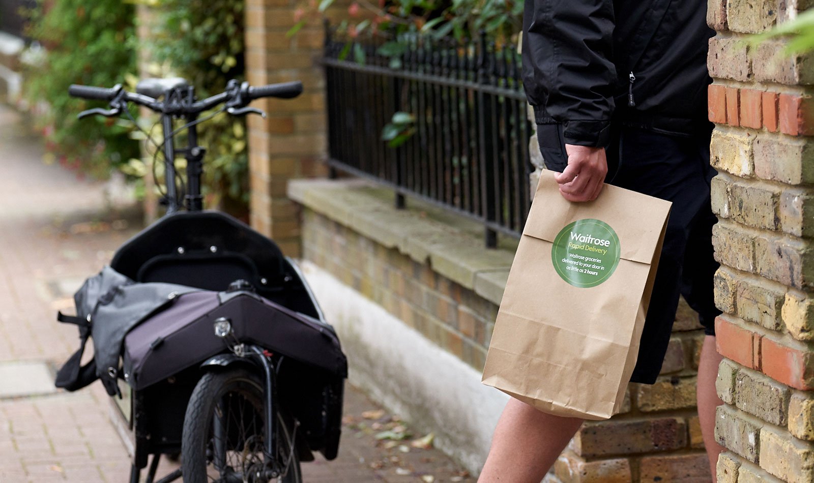
WAITROSE
Rapid Delivery
I worked with
PMs, Stakeholders, BAs and Developers & In-store staff
I have used
Figma, Sketch, Miro, Analytics, HotJar
Time scale
6 months - 1 year
Design Team
Just me (end-to-end design)
The service enables customers to select from a range of over 2,000 products, delivering up to 25 grocery items to their home or office within two hours or on the same day. Waitrose Rapid Delivery has seen a promising start, providing increased convenience and flexibility for shoppers with busy lifestyles. The growing demand from customers leaning on-demand shopping presents an opportunity to test the service's appeal in new locations, both within and outside of London. It's important to note that this is a trial service preceding the partnership with Deliveroo.
Overview
End-to-end design, User research, User testing, Data gathering (Analytics), Wireframing, Prototyping, Click-map user-testing, User testing, Responsive design, Acceptance Criteria creation, Design QA & testing, Stakeholder management, In-store checkout design & research, Collaborating with the Development team
Tasks
Challenges
(High-level)
Product Navigation & Search Functionality
Postcode Validation
checkout journeys & pages are hidden and not directly accessible from the homepage. On mobile, categories could not be navigated via the menu.
Categories were broad, and users could not easily infer the scope of products in each category
Include a note for each item to guide the shopper and specify preferences for selecting substitute or alternative items.
Business goals
Make it fast and easy to use for everyone, everywhere.
Create a platform for innovation and deeper engagement.
Decision-making based on on-site analytical data and feedback surveys.
Add to Basket button in the search results.
Shop from previous orders and multiple order tracking.
Postcode validation (New user & Existing user) & delivery slot booking.
Allow users to quickly navigate to products for a rapid shopping experience
Allow users to easily view popular & favourite products
Communicate clearly the scope of categories
Task
Improving the navigation & categorisation
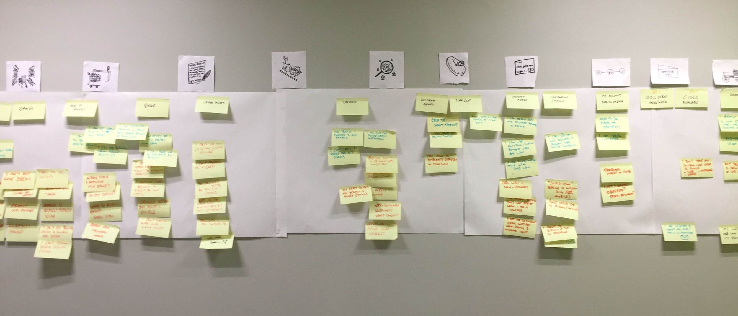
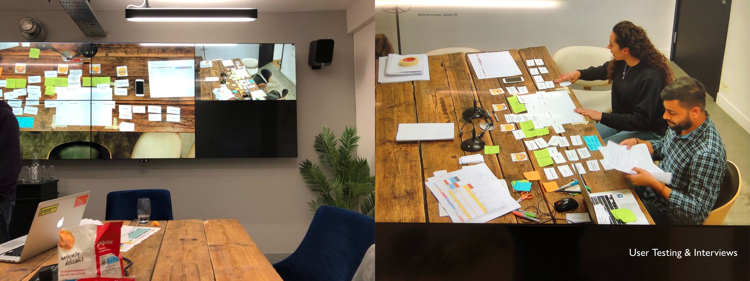
To gain deeper insights into user needs, I have started with workshops and card sorting activities.
-
1. Understanding the issue
2. Research and gather data
3. Prioritise the issues & work (problem statements)
4. Pitch the ideas to stakeholders
5. Wireframing the solution
6. Rapid prototyping
7. Test the concepts with the actual users and get feedback(Validating the designs)
8. Workshops and testing sessions when required
9. Iterate the wireframes quickly and test the prototypes
10. Check the data before and after to measure results.
-
+ 1 designer (that’s me)
Worked with a part-time user researcher to validate the discussion guides and questionnaire
1 BA, 1 PM, 4 Developers, 2 Logistics -
I led the whole design process from start to finish. This included collecting information (through user testing, feedback, and analytics), coming up with and testing ideas, researching users, creating wireframes and prototypes, attending meetings with stakeholders, participating in sprint calls with the development team, and making improvements based on business goals and user feedback.
I conducted a card-sorting research activity with our current customers. Participants ranked scenarios based on frequency, ranging from never to always. Additionally, a questionnaire provided users with an opportunity to describe scenarios that we might not have considered.
Card sorting activity
High-level customer journey mapping
Empathy-mapping workshop
In conjunction with on-site analytical data and feedback surveys, I conducted an empathy-mapping workshop to understand the end-to-end experience. For each step of the journey, we mapped pains, gains, and communications. I redesigned some complex user journeys, including checkout, navigation, and postcode eligibility, with the aim of reducing the bounce rate. Analyzing data and engaging with customers highlighted the challenges many faced during the checkout process and product discovery. After conducting interviews with stakeholders and product owners, I gathered sufficient information to proceed.
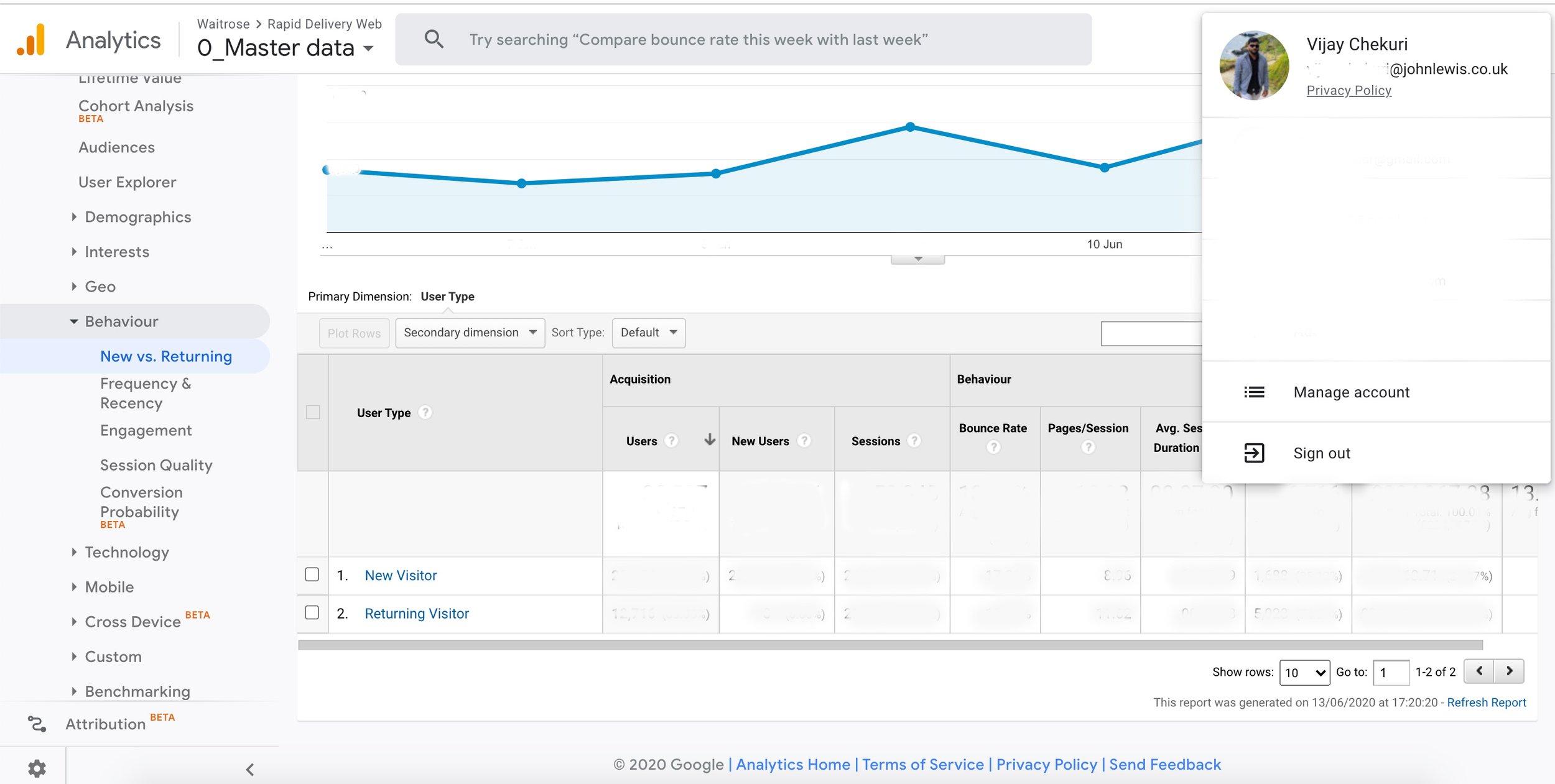
Data gathering from Google Analytics
I closely monitored customer behavior on a daily basis, examining funnels, bounce rates, patterns, devices, operating systems, and sources of visitation, as well as tracking conversions.
Concepts , Testing & Results
Concepts / Wireframing
The hypothesis was shortcuts beneath each category would give stronger indication of category breadth and quick navigation to popular product-list-pages.
The primary goal of Rapid was to provide a quick delivery service for groceries. It was essential the interface would:
Allow users to quickly navigate to products for a rapid shopping experience
Allow users to easy view popular & favourite products
Communicate clearly the scope of categories & Search results.
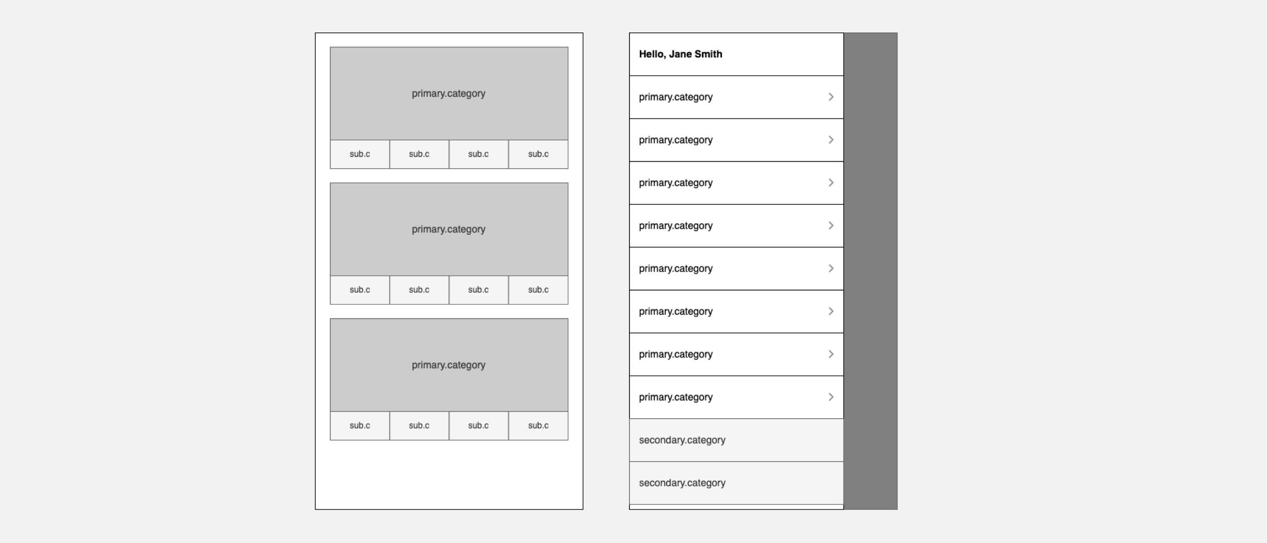
Upon landing directly on the homepage, approximately 70% of mobile users tend to infer the type of site and the range of products by employing a "Scroll & Scan" approach of the homepage contents. The hypothesis suggests that incorporating shortcuts beneath each category would provide a more robust indication of category breadth and facilitate quick navigation to popular product-list pages.
Testing a concept
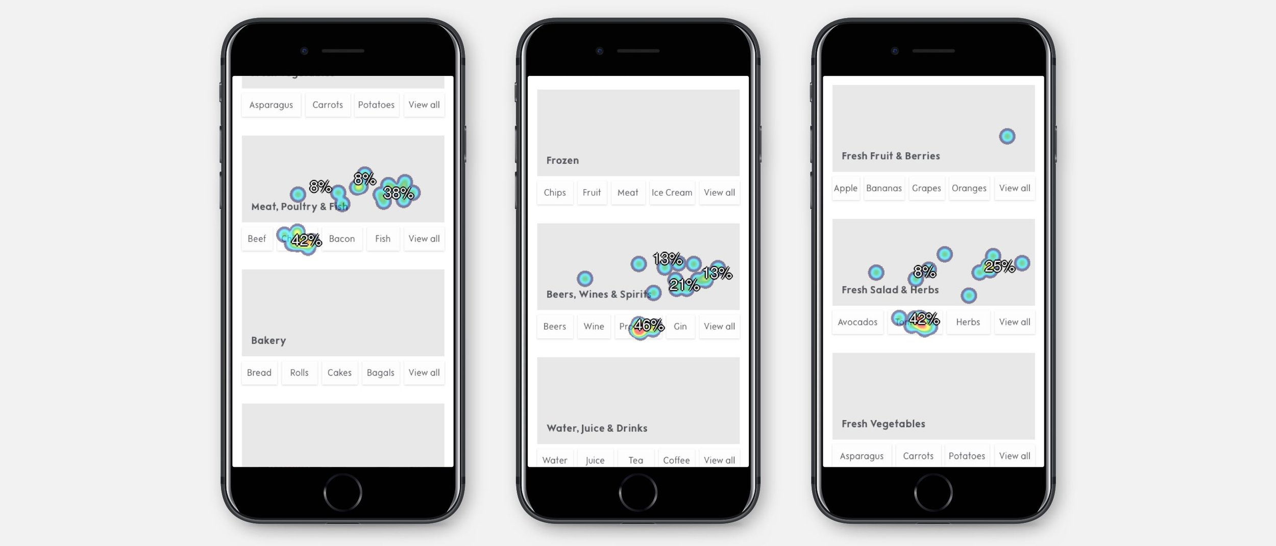
To test our assumptions on how the category shortcuts would perform, I organised a remote click-map task with 24 participants. Participants were tasked with finding a particular product by browsing. The results gave a healthy indication shortcuts were being not only being used, but guiding users to click primary categories. This validated our assumptions on user behaviour for the design.
Outcome and performance

One month after pushing the new designs live, we repeated analytics and heat mapping. The results were positive and booking conversions had improved significantly on mobile. Through-traffic had improved from the homepage to the experience and gift page.
Traffic to product pages
+25%
Traffic to the Checkout page
+38%
Task
Search functionality improvement
Issues
Based on analytics and customer feedback:
Users are required to visit the Product description page to add the item to the basket.
Users prefer searching for multiple items simultaneously for a quick shopping experience.
Mobile users heavily rely on search (over 80% usage).
Customers are interested in a smart search feature.
Business goals
What’s the impact on business:
Increase the number of items in the basket.
Reduce the bounce rate.
Enhance the overall shopping experience.
Facilitate quick and efficient checkouts to encourage customer return.
Multi-search functionality requires more dev resources (future sprint)
Feedback from users
We have installed a feedback button in multiple places. If a user is unhappy with something on the website and clicks this button, they can choose the screen or write about their issue. All our team members receive their feedback on our Slack channels, and we respond to them quickly, trying to resolve them as soon as possible. Our small team usually deals with issues within a few minutes or raises a ticket if it's a big issue, so the dev team can prioritize.
User interviews & concept testing
In the user interviews, I uncovered more issues and tested some concepts with real users to understand their point of view before fully diving into the design mode.
Search & Auto-suggest wireframes
A/B test


High-fed designs


What problem does it solve?
Users can now search for items using the smart search option. For existing customers, the smart search shows products based on their previous shopping history, while new customers see items based on keywords along with offers and prices. Users can add items to the basket directly from the search results or visit the category page for more options. This solution streamlines the process, eliminating the need to visit the product description page before adding to the basket. Users can now add items, checkout quickly, and experience improved conversion rates.
Search component usage
+65%
Search to basket
+89%
Existing customers (returned & frequent orders)
+45%
Additional tasks that contributed to improved conversion and a better shopping experience.
Task
Dashboard redesign
UX Challenges Identified:
Personal Details Update: Streamlining the process to minimize steps for changing personal details.
Order Tracking Enhancement: Improving the user experience for efficiently tracking orders.
Seamless Reordering: Enhancing the ability to view and shop from previous orders.
Simplifying Favorites: Optimizing the process of shopping from saved favourite items.
Billing & Delivery Address Update: Creating a more user-friendly approach for updating billing and delivery addresses.
I gathered feedback from multiple users and identified patterns through Google Analytics. Additionally, I analyzed Hotjar journeys specifically related to dashboard interactions, pinpointing areas where users encounter difficulties and recognizing the need for UX improvements.
Final designs went Live (after A/B testing)


What problem does it solve?
Users can always view their current order, and they have the option to shop from their previous orders and favorites for a seamless shopping experience.
Task
Multi item search
UX Challenges Identified:
Context of Rapid Delivery: Users utilize Rapid Delivery for quick orders, often on their way home from work or for urgent needs. The primary reliance is on efficient search functionality.
Item List Entry: Users commonly maintain lists on paper or in phone notepads. The challenge is enabling easy transfer of these lists to the website.
Minimizing Entry Steps: Reducing the effort required for users to input items again on the website, especially if they already have the list on their phones.
Editability: Users should have the ability to edit the list after performing a search, providing flexibility and control over their orders.
Final designs went Live (after A/B testing)

What problem does it solve?
In our refined user experience, customers now enjoy the convenience of searching for multiple items simultaneously. Through a single window, they effortlessly add selected items to their basket, ensuring a seamless and efficient process. The shopping list remains visible at all times, allowing users to review and manage their selections. Additionally, we've empowered users with the flexibility to edit and update their search list, providing a personalised and user-friendly shopping journey.
Analyzing the data, we observe a significant adoption rate, with 33% of users actively engaging with the new feature. To ensure widespread awareness, we've proactively communicated this enhancement to all users through targeted email notifications. This approach aims to maximize the impact of the feature, providing users with valuable information about the improved shopping experience.
Task
Basket page optimisation
UX Challenges Identified:
Users cannot add a note to the shopper: Sometimes, users want longer sell-by dates or different flavors.
Users cannot undo the removed item: Sometimes, users accidentally click on the delete button.
Able to choose a substitute for each item: Sometimes, users want a specific substitute item when the ordered item is not available.
Basket page final version

What problem does it solve?
Users can undo the removal of an item from the basket within 5-10 seconds. This feature eliminates the need for them to go back to the shop page or search to find the product and add it to the basket.
Users can add a note to the shopper and edit it until it's picked up by the shopper.
Customers have the option to pick an alternative item when their chosen product is unavailable in busy areas, ensuring a positive shopping experience.
Task
Checkout optimisation
I have observed the bounce rate on this page through Google Analytics and reviewed Hotjar videos to understand the issues and why some users are leaving after spending time adding items to the basket.
UX/UI Challenges Identified:
Lack of visibility on slot availability and prices before adding items to the basket.
Inability for users to reserve a slot while shopping.
Users leaving the checkout process due to frustration caused by unavailability of Rapid delivery when needed.
Checkout page optimised version

What problem does it solve?
Users can see the next available slot at all times in the top banner (as an MVP solution), and they can view other slots too.
Users can reserve the slot for 10 minutes, and they can extend more time when required.
Users can see a clear distinction between paid and free delivery slots.
The bounce rate was reduced to
13% (was 62% on this page)
Final results

7,000
slots added per week
1.2 million
potential households
1. 5 million
in sales (a big thing for a trial project)

More case studies

Waitrose WYA

Santander Bank
HubBox (SaaS)

Lebara Mobile